

Some may perceive disciplines such as graphic design as just 'making things look pretty'. Consequently, this perception could cause others to think that design and creativity is useless or pointless.
On searching for 'graphic design meaning' in Google, a dictionary definition sourced from Oxford Languages (2023) states that it is "the art or skill of combining text and pictures in advertisements, magazines, or books".
This definition almost feeds into the perception of 'making things look pretty', potentially trivializing the craft involved. Furthermore, there is little reference to the process or thinking behind a design project, making the discipline seem ad-hoc or that anyone can do it.
Harland (2011) suggested that the definition of graphic design has "dimmed" due to other related disciplines such as illustration and information design becoming more prominent.
Additionally, some may not see graphic design as future-facing or digital leaning, when many designers do work across a range of media and outputs, classing themselves as multidisciplinary (Fuller, 2020) . This could indicate that graphic design is undervalued and misunderstood.
Consequently, it could be suggested that more education is needed about what graphic design is. More talks and workshops could be run in primary schools (Vipond, 2015) and secondary schools by practicing designers. Education can also occur with businesses and clients too. May (2023) interviewed various designers, who suggested that involving non-designers in the creative process and workshops can provide individuals with insight and appreciation for what is involved.
It could be argued that by talking more openly about what design is, its process, and its value on businesses and society, that this could refute the perception of uselessness.
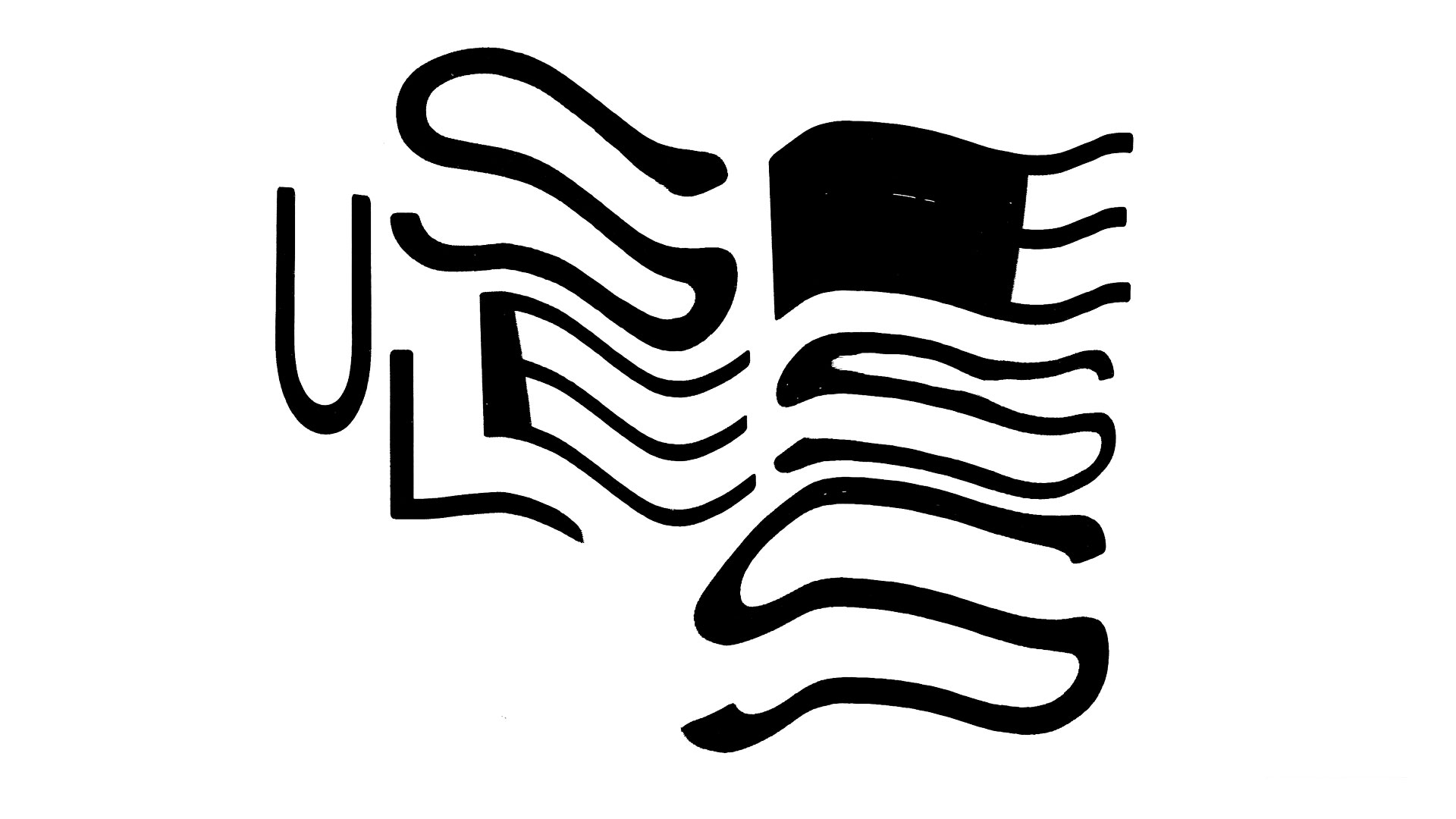
After creating a typographic composition digitally, this was then printed onto paper. The print was moved around a scanner to produce a contorted, stretched photocopy. This scanography experimentation took place several times until one was selected. In the distorted Useless typography, the S and E characters are enlarged and almost bulging. The fragmented and manipulated letterforms reflect the meaning of useless, as the type has not been used for its usual purpose.
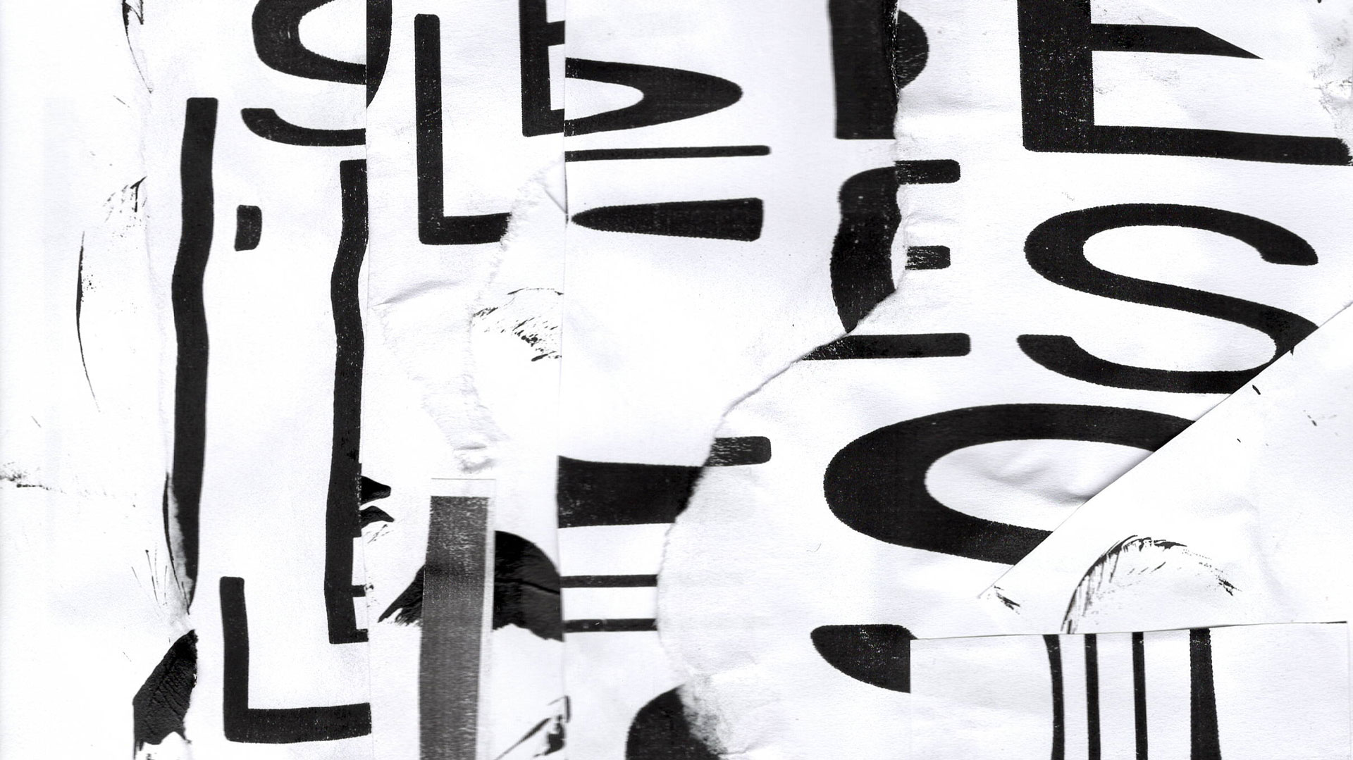
A collage was created by using cut-up scanograph typographic compositions and mark-making from paint and ink. Some elements have been torn, creating imperfect shapes and edges. The overlapping textures and manipulated shapes create a sense of abstract chaos. Using a monochrome color scheme also added starkness.
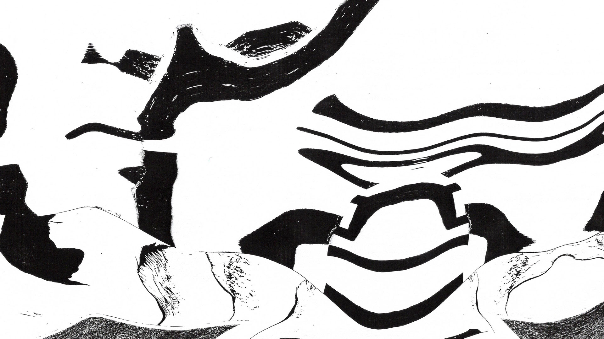
To create an even more abstract feel, the collage went through the scanography process. In the Useless scanography collage, there is little evidence that the image originated from typography and lettering. The resulting image has interesting organic forms and warped and manipulated textures.

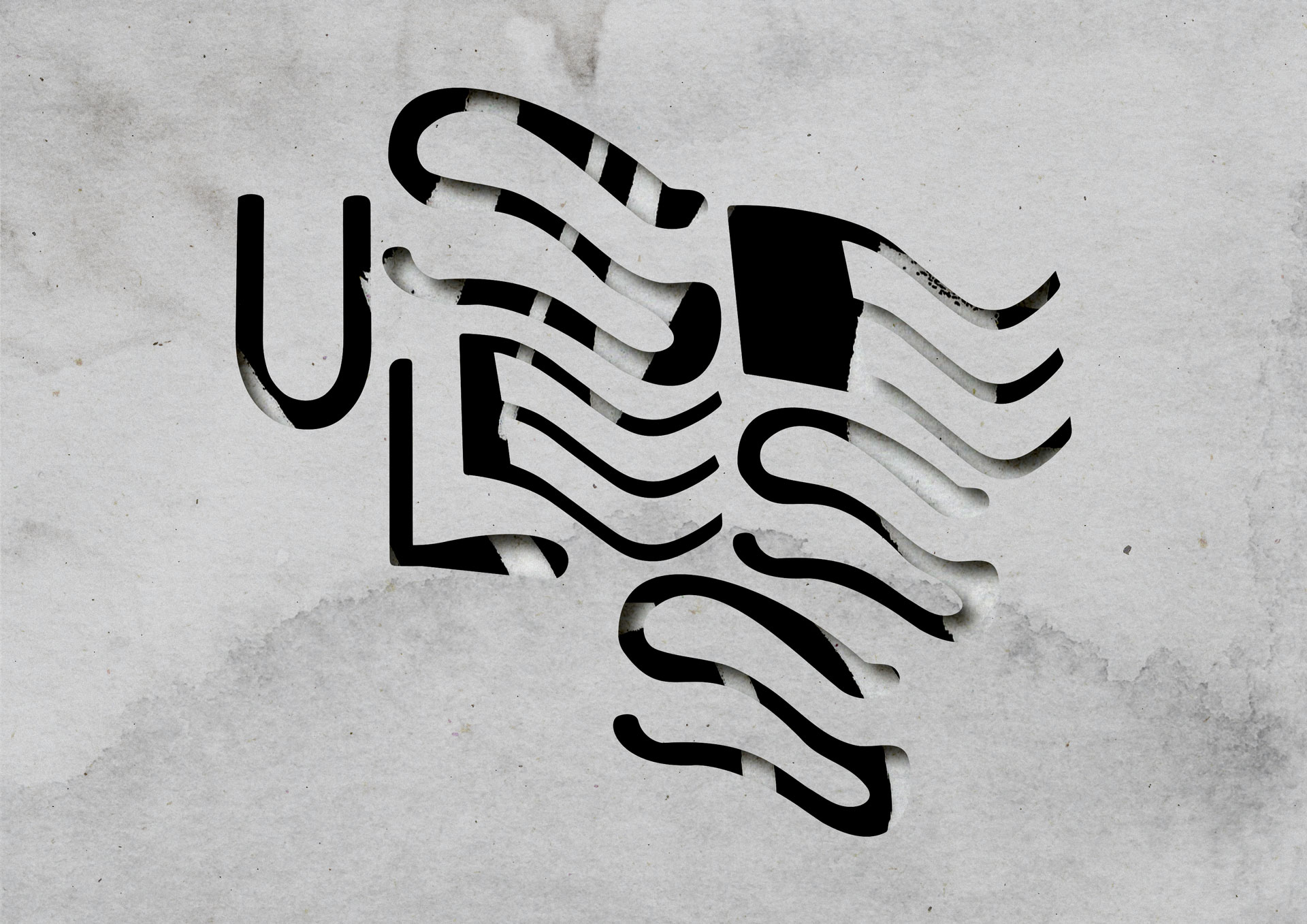
The scanograph collage and distorted scanography type were brought together digitally. Using Adobe Illustrator and Adobe Photoshop, a graphic resembling a stencil was created. In Design is Useless, additional paper textures have been used to add further grain and markings. The grey paper texture looks like stone, reminiscent of carvings in rock.