

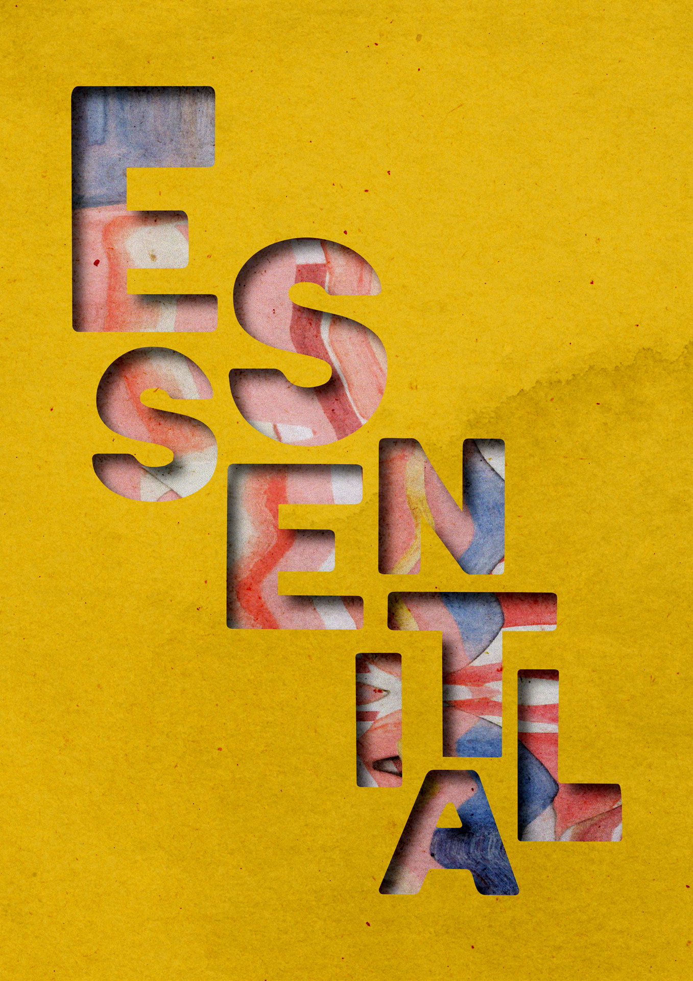
Graphic design and visual communication involve portraying a message in some way. Though this could be for commercial means in the form of advertising, design can also be used for social good.
In 1964, Ken Garland launched the First Things First Manifesto (Design is History, n.d.) . Supported by other creatives, the manifesto aimed to shift the direction of design, asking designers to consider using their skills to support causes more important to society. Hassell (2020) suggests that design agencies should work with charity or not-for-profit based clients, finding ones that link to causes that their employees are engaged about.
As well as supporting causes for social good, some creatives may also contribute to design activism. Markussen (2013) explains that design activism may push for social change, raise awareness of global issues, or oppose views of consumerism.
However, Bichler and Beier (2016) argue that many design activist campaigns heavily borrow techniques from advertising, persuading rather than informing. They suggest that design activism should empower the viewers and readers to make decisions based on facts and information (Bichler and Beier, 2016) .
Another issue around design activism could be a lack of authenticity. McCool (2017) interviewed Kelly Schoeffel of creative agency 72andSunny, who explained that creatives need to care about something and empathise with the issue to design effectively for it. “…the work cannot be self-indulgent. Lead with empathy, be generous” (McCool, 2017) . It could be suggested that some designers may create activist work because they feel it looks better for their portfolio rather than there being an authentic meaning behind it.
However, in a world where there continue to be inequalities and injustices, it could be argued that design for social good and design activism are essential to encouraging change.
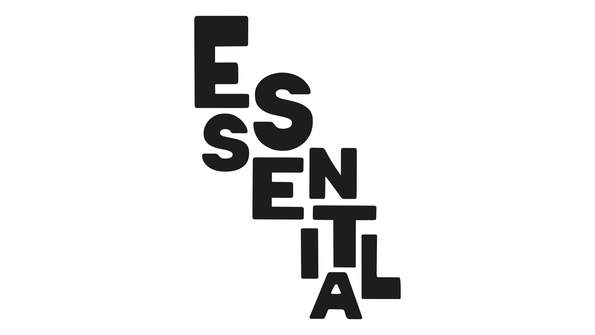
Using Adobe Illustrator, a digital typographic composition was crafted. The process involved exploring the possibilities of distorting typography by scanning printed material. Although multiple attempts were made, further digital manipulation was necessary to achieve the desired outcome. As 'Essential' is a positive perception, the level of warping was lessened to allow the word to be visible. The stretching and the chunky, rounded type create a playful effect.

An analogue collage was created using different textured papers. Watercolour paint and inks were applied to card stock. This was then cut into triangles and rectangles and overlapped. In addition, scanographs of lettering were included. The number of layers in the collage aims to represent the importance and detail of design and how essential it is on every level.
A scanograph of the collage was produced. Gentle waves depict momentum and energy. The visual has an overall positive vibe, with the subtle grains and glitch providing texture to be used within the final Design is Essential digital stencil graphic.

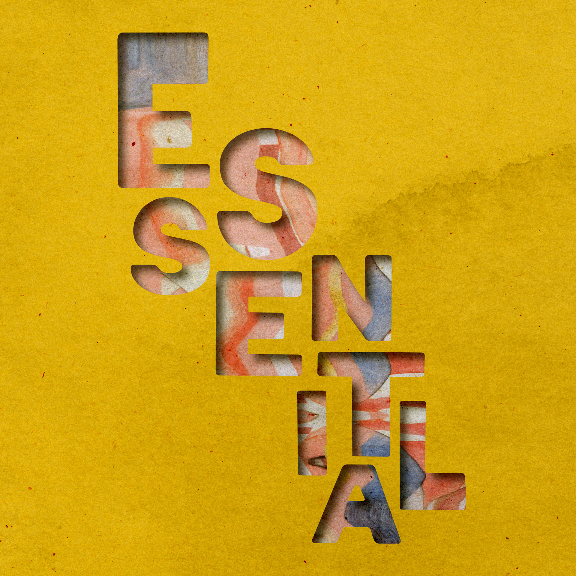
Digitally, the scanograph collage and distorted scanography type were merged. Adobe Illustrator and Photoshop were utilized to create a graphical representation of a stencil. The use of a yellow paper texture adds further vibrancy to the message.