

Some may link the concept of creativity with invention, such as the generation of new ideas or pushing boundaries.
However, a report by Porto Rocha and Float (2022) found that designers are concerned about a lack of originality and sameness, as inspiration looks so similar. Goodspeed (2022) defines this as a moodboard effect that is particularly prominent in advertising. Goodspeed (2022) explains, "Reference images are considered only by era, by subject, or by setting, rather than as a unified amalgamation of ideas and aesthetics.” By limiting inspiration to the same subject or topic, this can contribute to styles being repeated over and over again. Looking at different inspirations or gathering ideas from the wider world can lead to more creative idea generation.
Furthermore, an article by Hartnett (2017) discusses the reliance on software such as the Adobe Creative Suite. Continually using the same tools could hamper productivity, as creatives are locked into a particular way of working. However, there could be ways to combat this.
A study by Grigg (2020) explored the concept of 'material literacy' and using different materials and media to generate design ideas. Grigg (2020) believes that analogue and digital processes can be hybridized within the creative process. This mix of materials could be used in all design disciplines, with experimentation and play encouraged at the start of a project.
Yahya et al (2021) suggest that design can be broken down into two categories: routine and inventive. As designers, there will be projects that require a more routine and standard approach. However, there will be opportunities to innovate and invent, finding solutions to challenging problems.
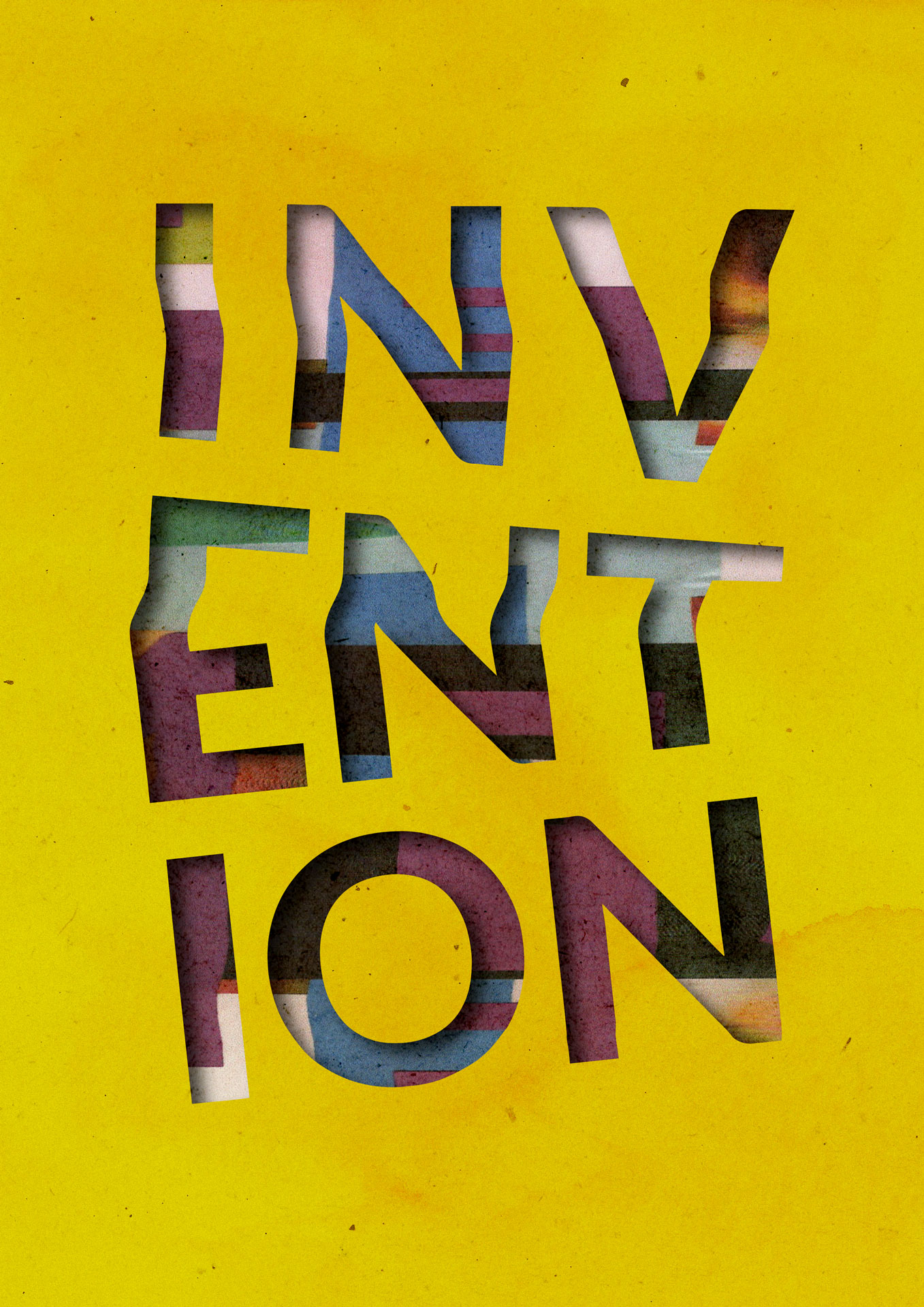
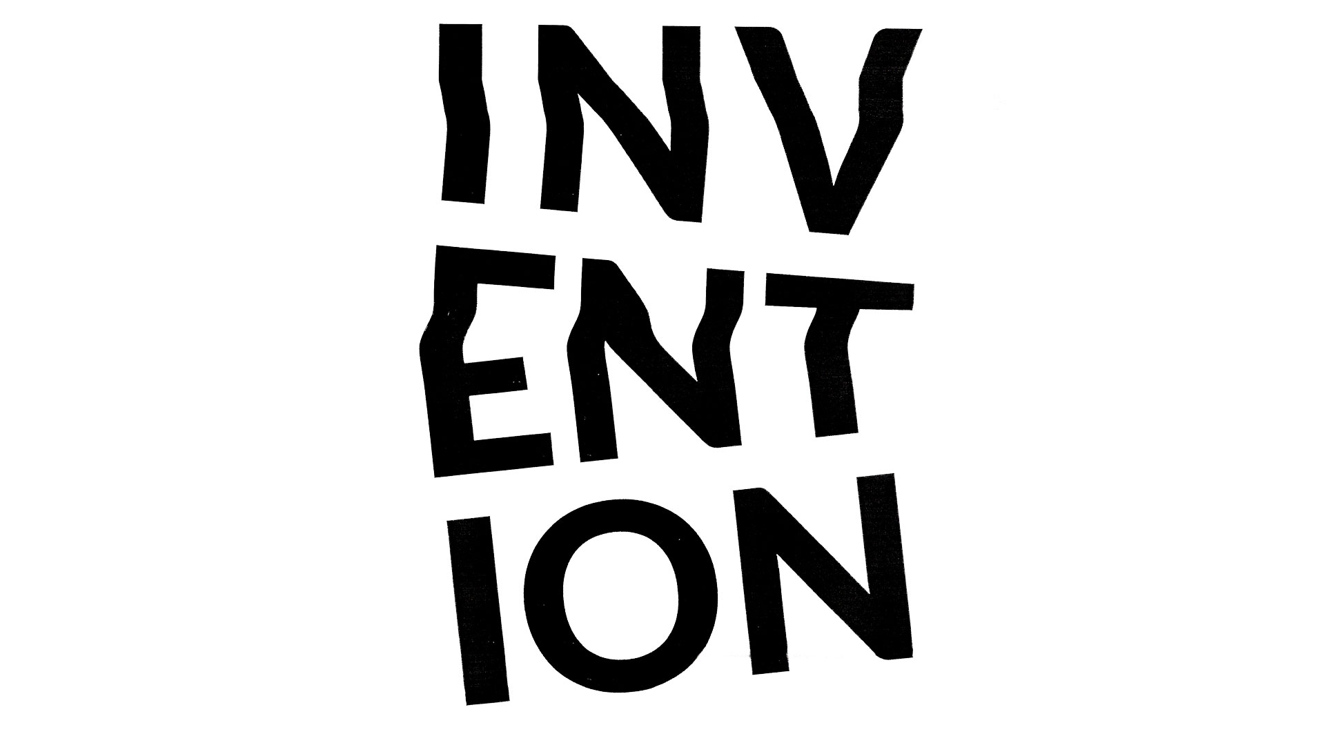
A digital typographic composition was created using Adobe Illustrator. The process involved experimenting with distortion techniques by scanning printed materials to explore creative possibilities. To maintain the positive perception of ‘Invention,’ the extent of the scanography manipulation was reduced to ensure the word remained clearly visible. The stacking of the letters represents invention and the building of ideas.
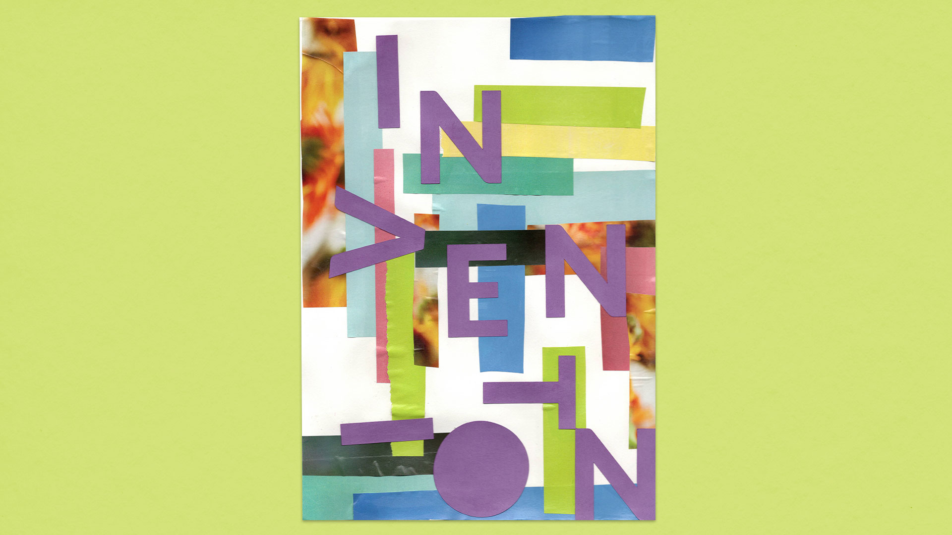
Using paper stock and magazine pages, geometric shapes were cut out to create a collage. Bright colours were selected to showcase positivity and forward-thinking. The word ‘Invention’ was die-cut from purple card stock and positioned abstractly across the piece, reflecting how ideas can be built.
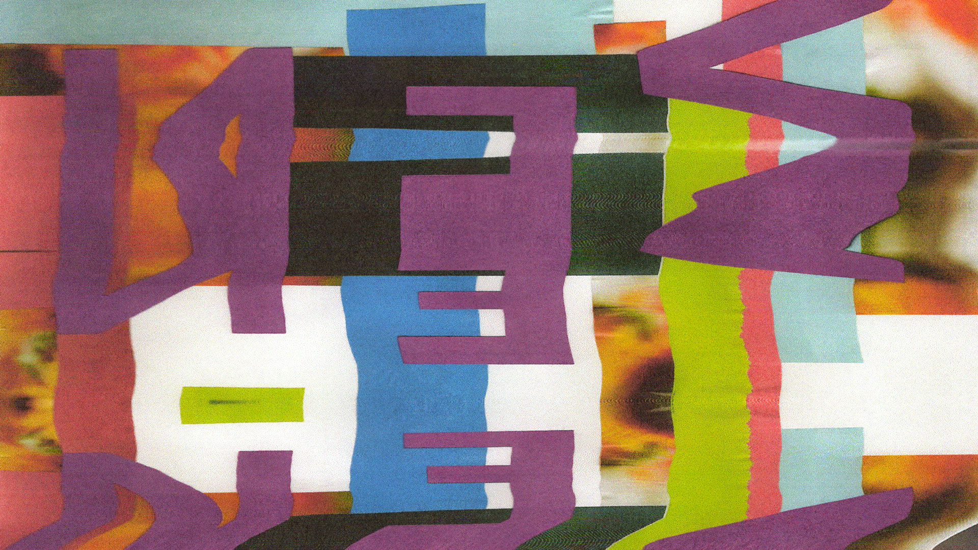
The collage underwent the scanography process, producing an abstract background texture. Subsequently, each scanograph was re-scanned to create further manipulation. The resulting image blends organic forms with sharper edges, showing how ideas can flow from one another.
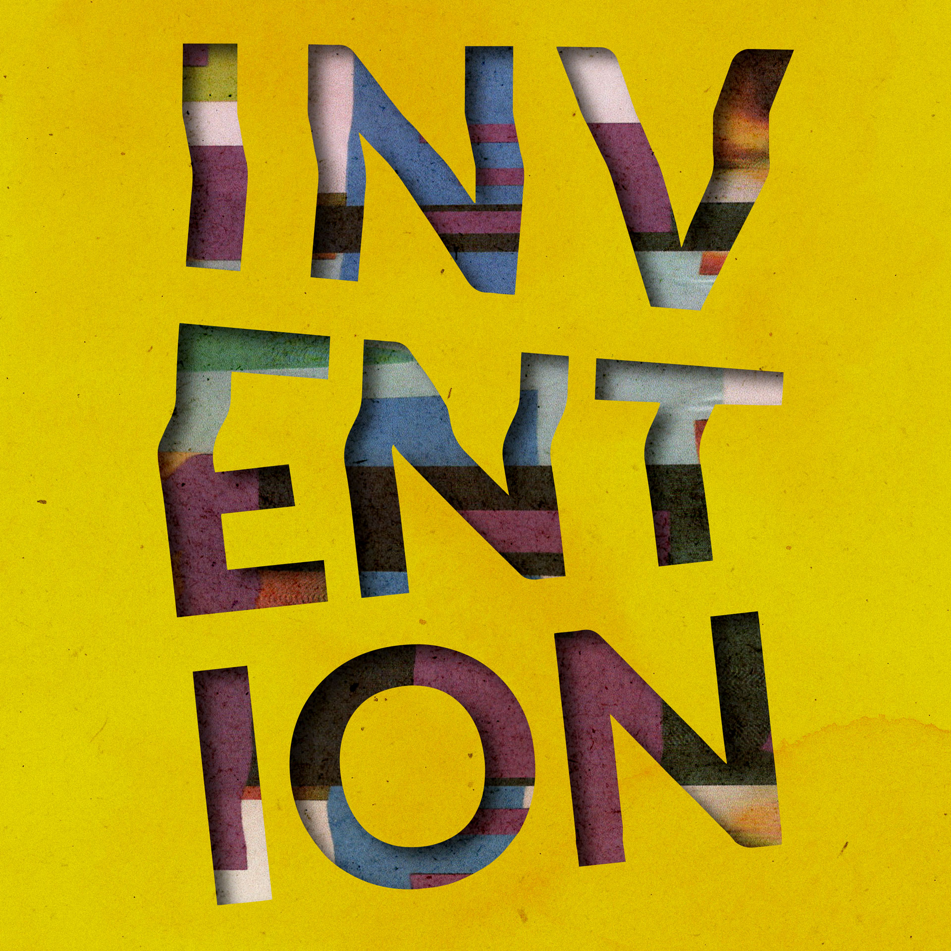
Digitally, the scanograph collage and distorted scanography type were combined. Adobe Illustrator and Adobe Photoshop were used to create a stencil graphic. In the Design is Invention piece, supplementary paper textures were incorporated to introduce additional grain and markings. The pops of colour from the stencil overlaying on the scanography collage look almost like blocks and grids.