

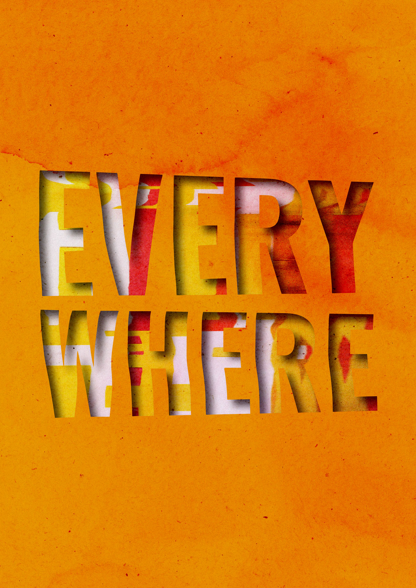
Design is everywhere. Whether we think a design is good or bad can be down to opinion. As well as visual work inviting critique and opinion, subjectiveness can occur in a different form from the designer themselves.
A designer's experiences, emotions, and thoughts will likely influence the final output (Indeed, 2022) . It could be argued that this brings a 'creative stamp' or signature style to work. This subjectiveness may work in disciplines such as graphic design and illustration. However, there also needs to be consideration into objective design.
Objective design considers the user's needs and "provides a logical structure that plays into our innate psychology" (Fisher, 2010) . This objectiveness is more prominent in disciplines such as user experience and product design, where research and workshops occur. Gaining empathy with users and their needs allows practitioners to find a solution that is usable, efficient, and accessible. UX and product design practitioners are frequently told not to design for themselves and this is a founding principle often described as user-centered design. Tools such as empathy maps and personas can support this.
Although graphic design and illustration may be considered to be more subjective and influenced by the creative making the work, a brief is worked to that includes details about the target audience.
Harvey (n.d.) explains that a lack of target audience could make content creation difficult, as there is no direction. Harvey (n.d.) suggests that understanding who, what, why and where can "create consistency in your messaging" and more impactful design. Clearly written briefs based on research help to focus outputs, ensuring they are relevant and meaningful to those engaging with them.
Consequently, though some creative disciplines may have more subjectivity, it is key to blend this with objectivity to ensure that audiences are at the heart of the design.
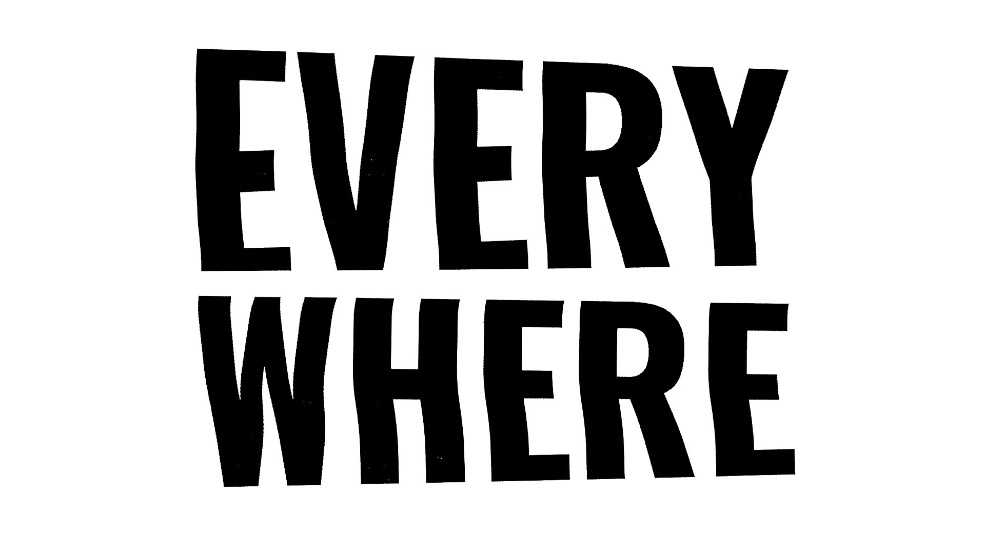
Firstly, a typographic composition was created within Adobe Illustrator. Employing a bold sans serif font, the word 'Everywhere' was designed to be bold, chunky, and make a strong statement. The composition was then printed and manipulated on the scanner plate during the photocopying process. The manipulation in this instance was subtle, with the type having a slight wave to indicate movement.
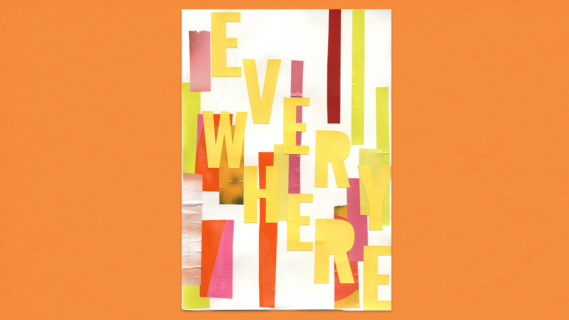
Using geometric shapes, a collage was assembled from paper stock and magazine pages. To convey a sense of positivity, a vibrant and bold colour palette of orange, yellow, pink and red was selected. The word 'Invention' was die-cut from yellow card stock and positioned diagonally across the composition. Its prominent placement serves as a symbol of defiance and determination.
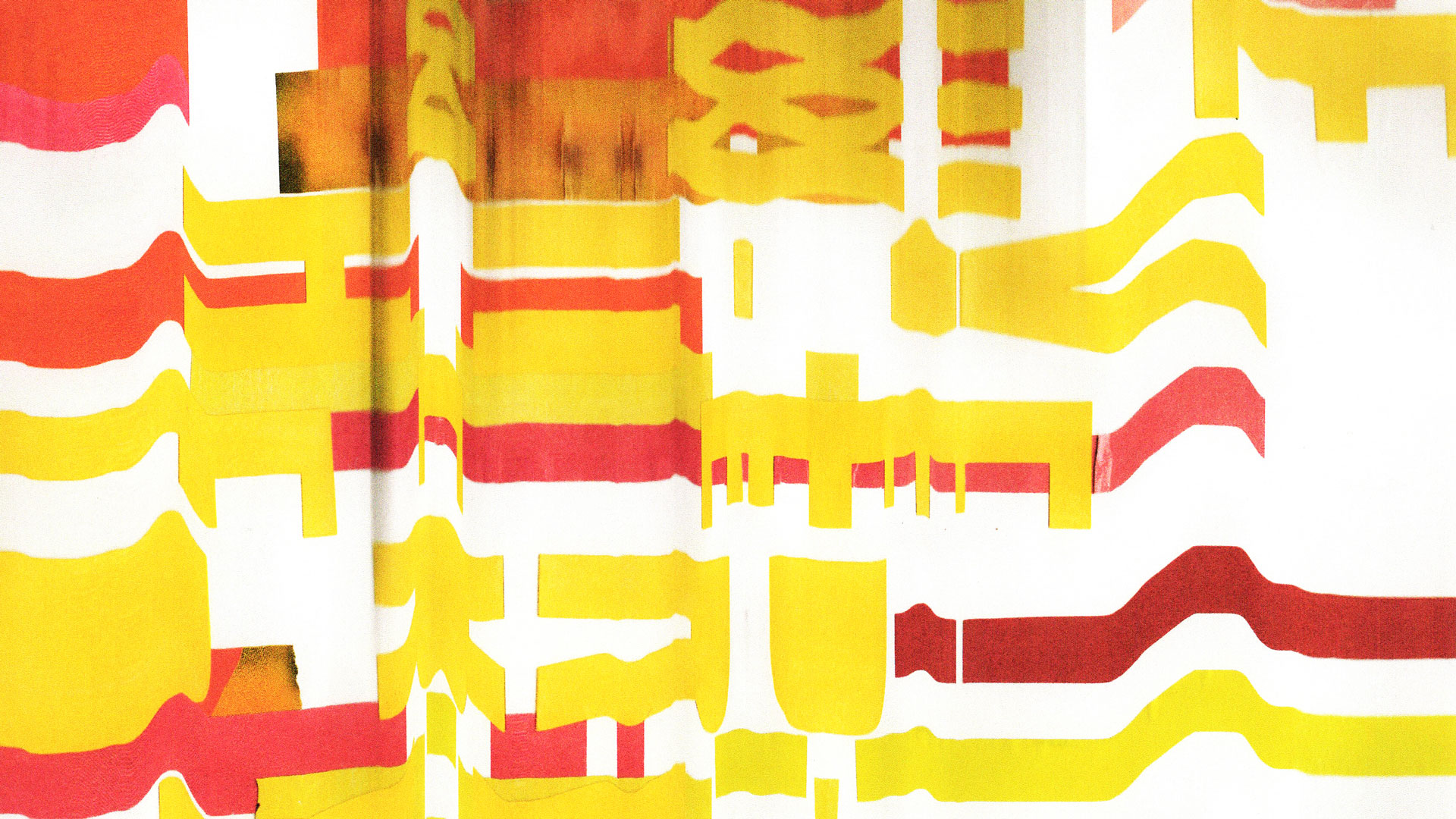
The collage was subjected to the scanography process, resulting in an abstract background texture. The patterns that the process has generated almost look like sunbeams or sound waves, suggesting how design and creativity surround us.
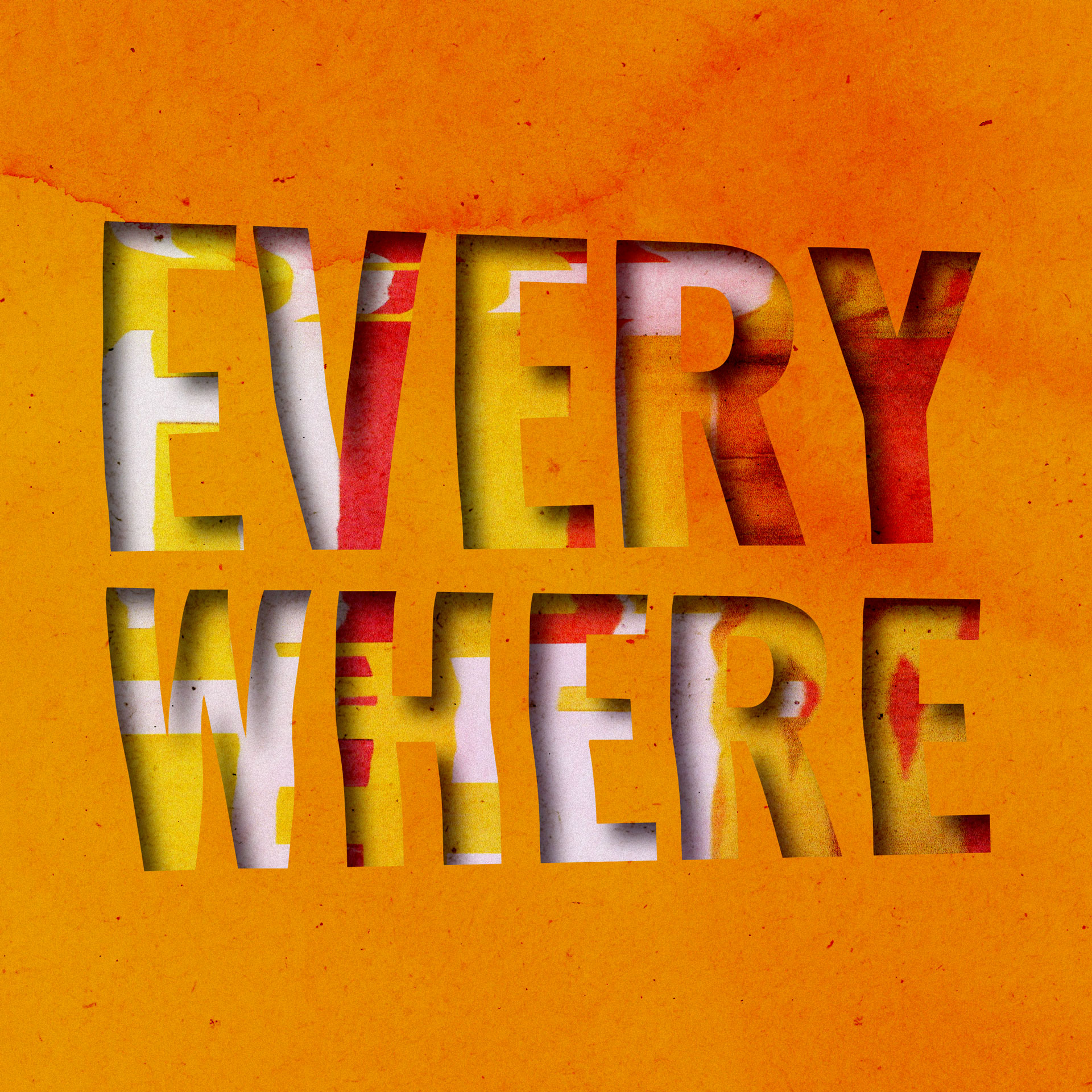
Digitally, the scanograph type and scanograph collage were combined to create a stencil-like graphic. The stencil type cut-out overlays the scanograph collage, with bursts of bright colour showing through. Additionally, the surrounding paper texture background was manipulated in Adobe Photoshop, with the colours and tones adjusted to look fiery. This aesthetic aims to dispel negative perceptions about design and creativity, showing that they are indeed everywhere and important.