

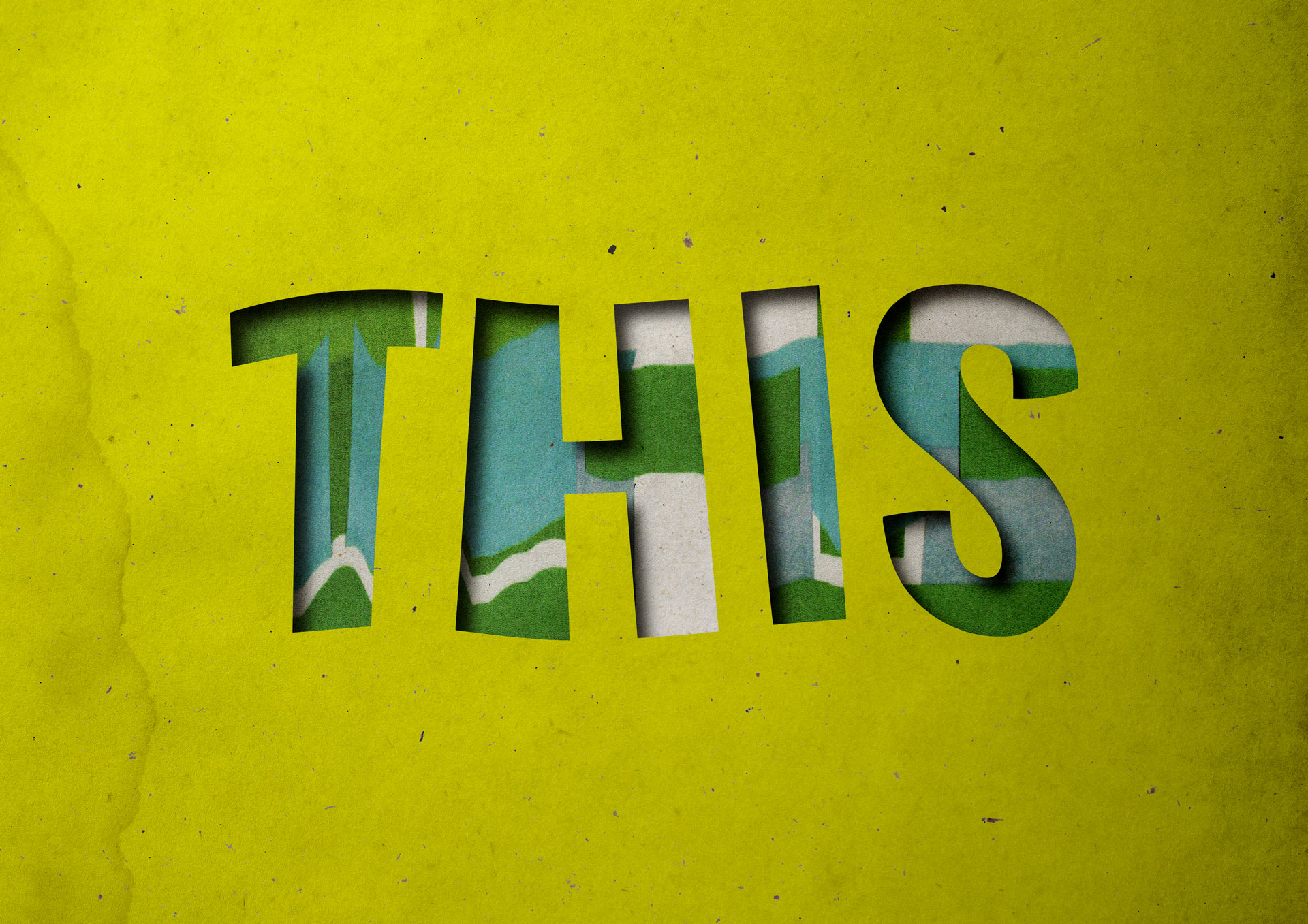
It could be argued that design is this: the device, screen, and digital interface that you are currently interacting with.
However, when using products and interfaces, little thought may occur about how or why it was created or the team behind it.
Regarding the first iPod, Arieff (2023) explains that “the ease of use and elegance of form erased the object from its context”. Arieff (2023) goes on to discuss that some design teams and businesses still work in this way, not thinking of the context, the user, or the responsibilities they should have towards the environment.
Furthermore, it could be suggested that the creative industries have an inequality problem. A report by Brook et al (2018) revealed that the creative and cultural industries lack diversity in terms of ethnicity, gender, and social class. If designers working in the industry do not reflect the society they are creating for, then outputs may not empathize with or meet the needs of the public.
Consequently, cultural and environmental context needs to be considered within all designs. User research must take place to ensure that products meet users' needs. Fairer hiring practices need to be implemented to ensure that organizations have a diverse workforce representative of society. Design surrounds us, and every product should be created with care and consideration.
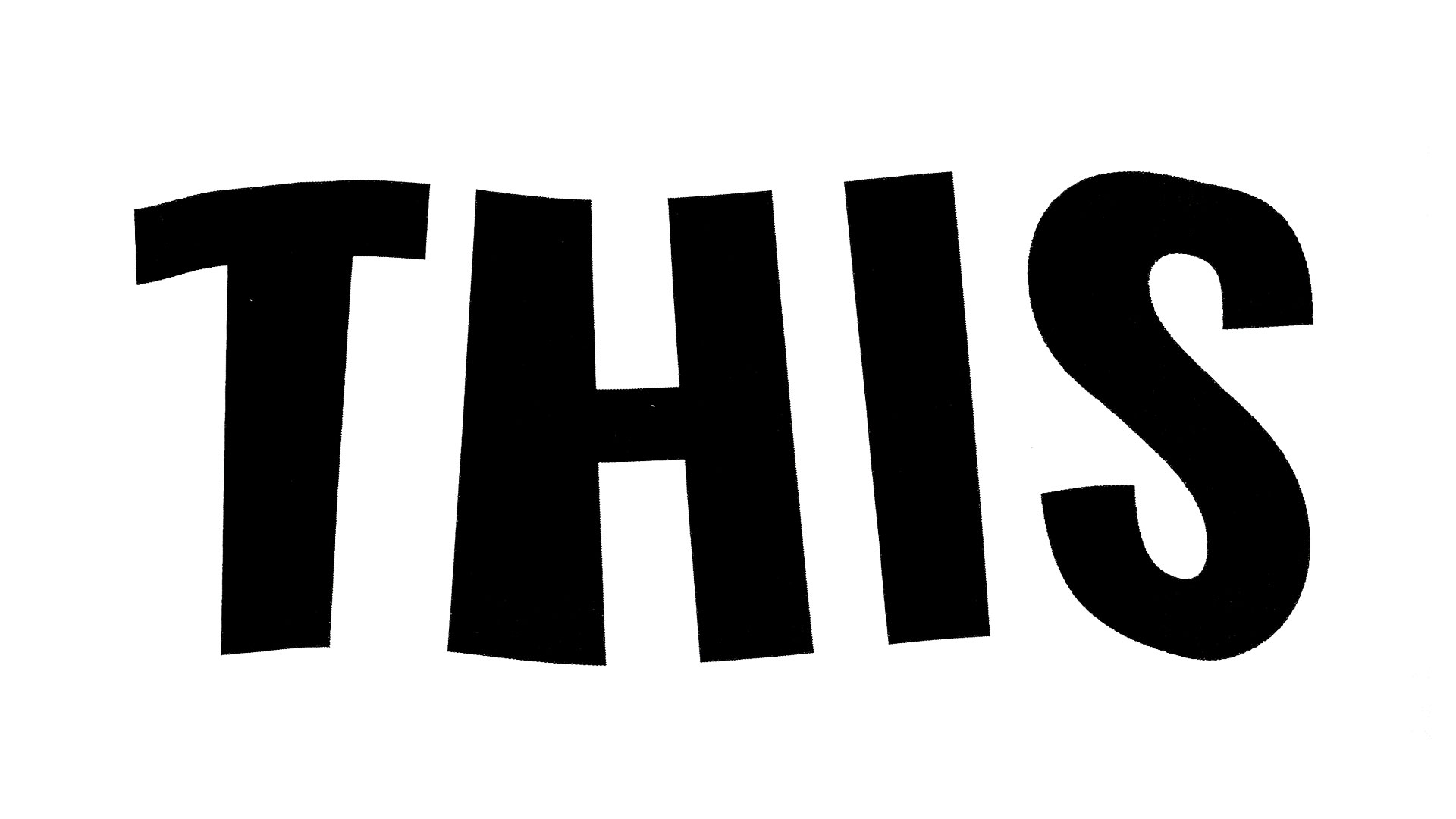
To begin with, a simple typographic composition was crafted in Adobe Illustrator. Using a bold sans serif font, the word ‘This’ is bold, chunky, and statement-like. The composition was printed and manipulated on the scanner plate when being photocopied. The resulting scanograph has a jaunty wobble effect, that gives a sense of movement and defiance. The scanograph was digitised in a vector format.
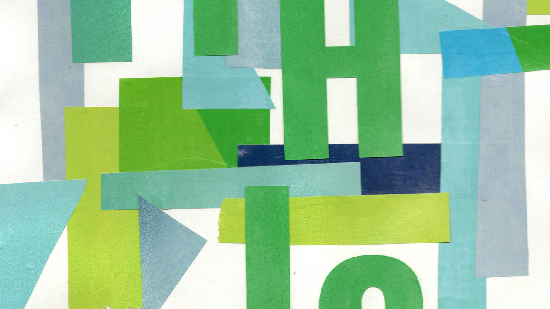
By utilising paper stock and magazine pages, geometric shapes were cut out to form a vibrant collage. Some magazine pages were slightly transparent, so other elements show beneath it. Green, teal, and blue tones are often associated with calmness, trust, or positivity within colour psychology, so using them in this context highlights how design is everything we see and can be respected.
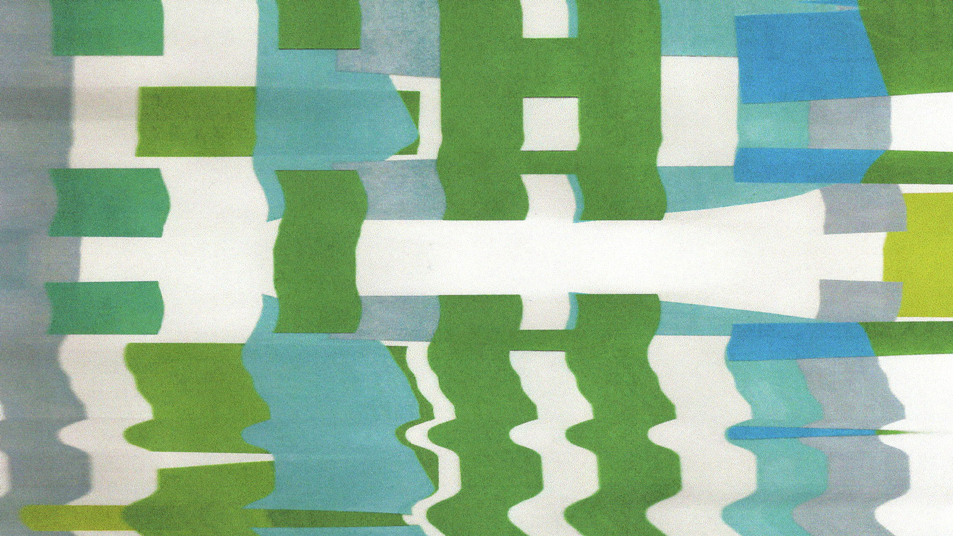
A scanograph of the collage was produced. The amount of manipulation on the scanner plate was minimal, as it was key to show a sense of defiance and stability in the overall texture. The collage scanograph provided a background texture for the final digital stencil graphic, Design is This.

By bringing together the scanograph type and scanograph collage digitally, further experimentation took place to create a stencil-like graphic. The stencil type looks as though it has been cut out of lime green paper, with the scanograph pattern peeking through. The overall aesthetic is bold and energetic, reaffirming that design is everything we are looking at.