

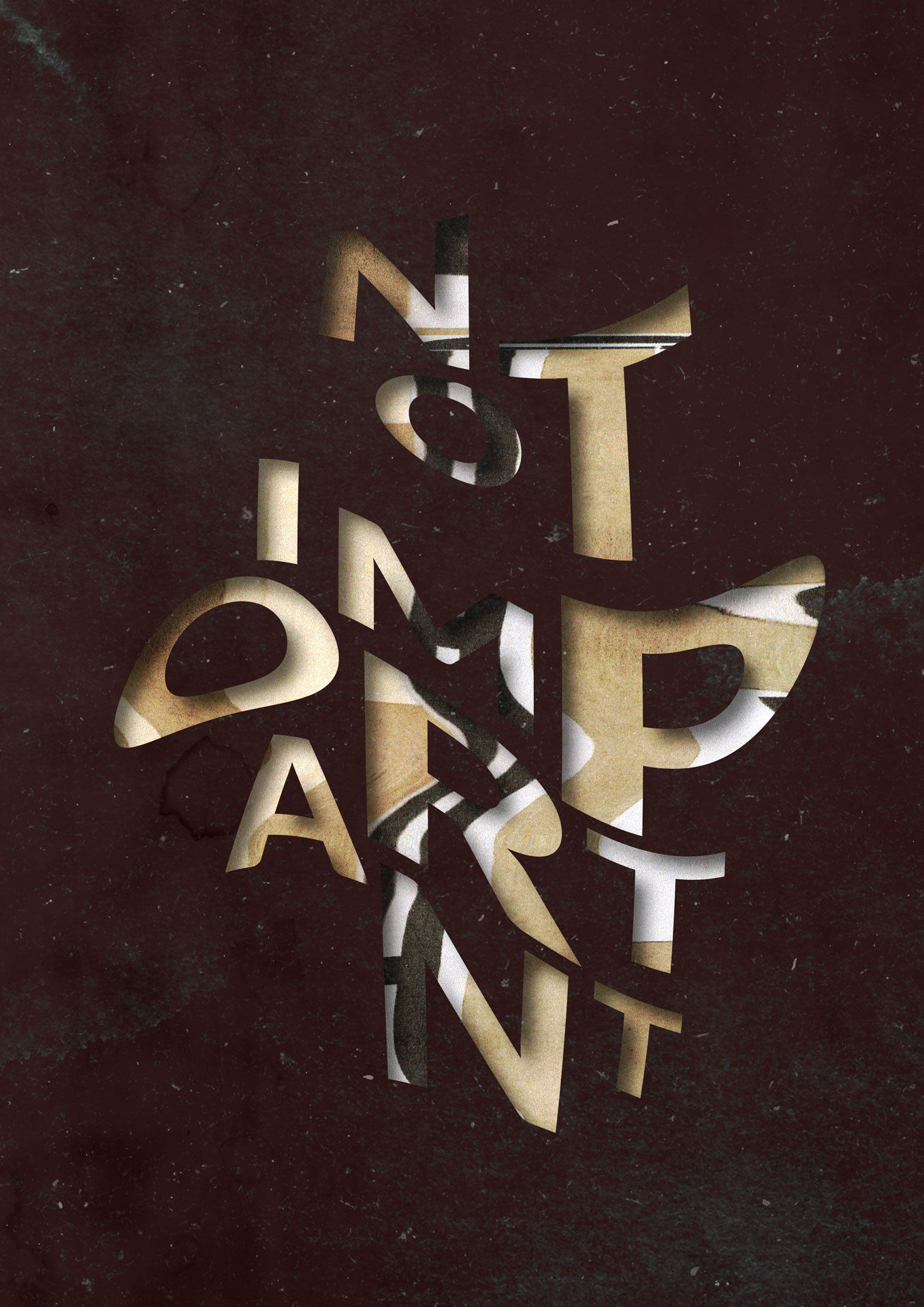
The perception that design is not important could stem from individuals prioritizing other aspects of a project or business over design.
From a user experience (UX) perspective, practitioners often highlight the challenges in getting business stakeholders to consider and prioritize UX. Austin (2018) suggests that some reasons for this include a lack of time and money. However, a particularly concerning insight could be that stakeholders think that they already understand their target audience and know what works best for them.
Although some stakeholders may reflect their target audience, the needs of users and what is required of a design goes much deeper than this. Sharon (2016) argues that a product design should not be created without a real user need. Research should underpin all design decisions.
Furthermore, it could be argued that embedding UX and UI (user interface) design principles in digital products can increase engagement and accessibility (UX Design Institute, 2018) .
Individuals navigate through many digital products, apps, and websites on a daily basis. With so much choice, people can choose to boycott a brand if they have a poor experience and choose an alternative instead.
Consequently, it could be argued that design is important. Design is not just about aesthetics, but allowing individuals to read their goals by accessing digital products with ease and efficiency.
A typographic composition was created digitally in Adobe Illustrator. Experimentation occurred by moving the print on a scanner to produce distorted typography. However, despite several iterations, the result required more digital work. The Not Important distorted type is skewed, warped, and stretched, indicating to the viewer that the further it stretches - the word and negative perception could disappear.
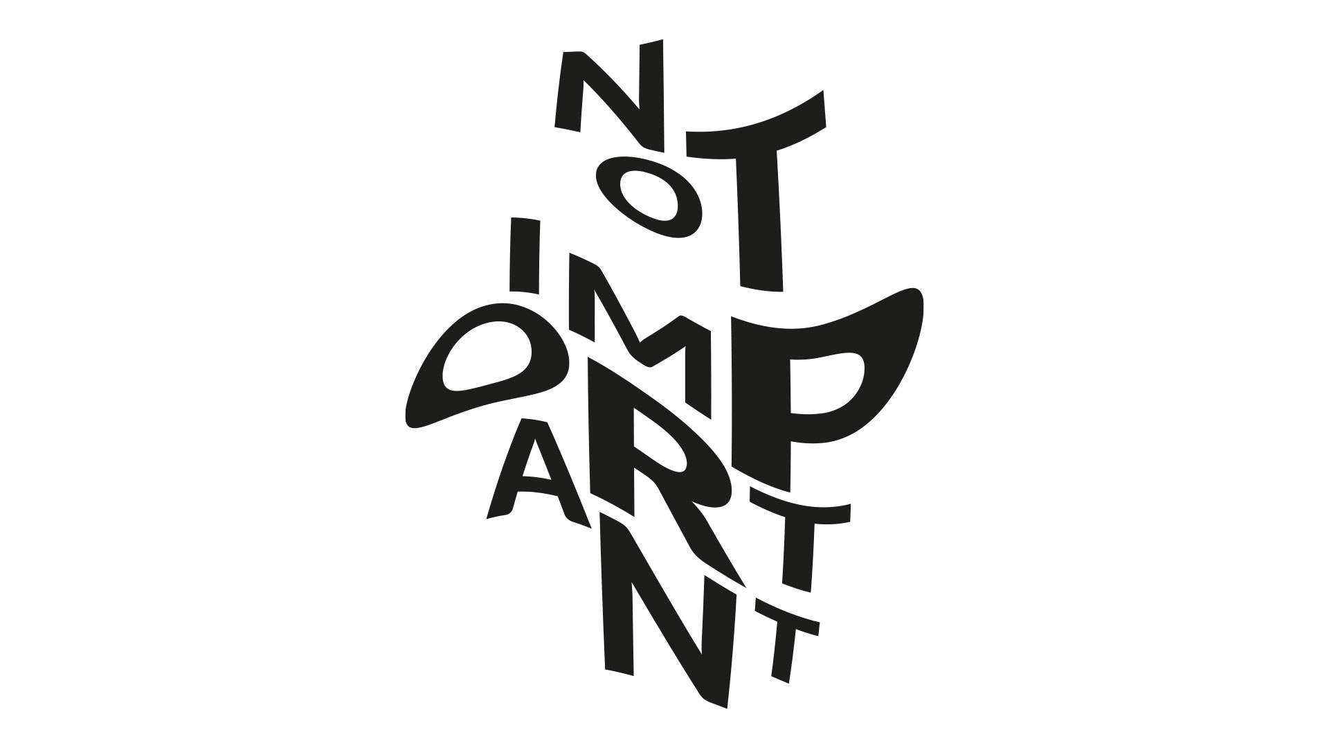
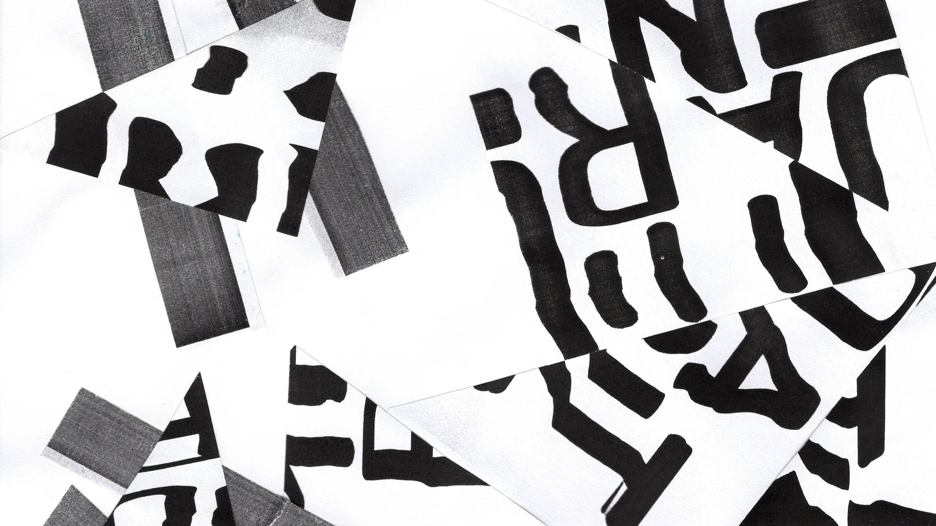
A range of typographic compositions and scanographs of the word 'Not Important' were cut up and included in an analogue collage. The paper was cut into triangle and rectangle shapes, creating harsh lines and an abstract feel. The lettering is distorted, making the words illegible and unreadable.
The Not Important collage then went through the scanography process. The selected visual has waved forms which stand out against the blank space. These patterns provided a background texture for the final digital stencil graphic, Design is Not Important. However, digital manipulation of the scanograph collage took place to change the monochrome image to have tones of brown.


The distorted type and scanography collage were brought together using Adobe Illustrator and Adobe Photoshop. Along with paper textures and color manipulation, a stencil-like graphic was produced. Some of the letters are more difficult to read, signifying that the negative perceptions could erode or disintegrate.